Last week I have changed my blog design. It was so fun doing make over on the site where I can do anything I like without restriction, btw It is my site after all. Hehe.. It goes as what I want, the way I like, the green colour, the new widget and the still Mr. Garfield~ =) It takes me about 2 days to decide the best design for my blog and here is the process how it changed:
1. The original design: Green Watermark template and orange background, I'm using it for more than 3 years. Look simple, not crowded and good enough for a rookie like me. However the recent days when I visit to my friend's and other blogs, I realize that most of the professional @ senior blogger has unique design of their own. At least not as simple and bluntly use common template like mine. hehe.. I like my original template, but it seems not cool to have many people sharing the same look. =P So after many years, I decided to change it for good!
My original design of 3 years..
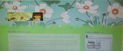
2. Flowery background: I stick with watermark template as I think it is quite simple and I really like the unique dotted line. So I think I just need to change the background. One pattern that captures my heart is the flowery background, so I try it. I like the white flower and blueish background, but when applied to blog It is too crowded and I cant even read my post.
Too crowded, not readable, REJECT
I try using the same pattern but with solid cream background for the post. The post is readable, but it still looks crowded....
Readable but still crowded, REJECT
Still I insist to use the pattern. "How about if I use the original green watermark? With this I can have green theme, and use the flower pattern". It seems a good idea. However the result......... look weird and funny, REJECT! haha
Weird, REJECT
3. Rose petal background. It seems simple, not too colourful and nice. But, I don't really like pinkish theme, so this background also REJECT!
Pinkish, REJECT
4. A flower background. If a background with crowded pattern is not suitable, lets try a more simple background that has only one flower on it. So I try the daisy background. Not bad, nice, simple and readable....... But again when thoroughly looking on it, I still hope to have green theme for my blog.
Much better, but not my style, REJECT
5. Suriana maritima. Finally I learned that I can use my own picture as background. The first flower pop in my head is Suriana maritima, the flower that has same name as mine.. hehehe.. Proud of it =D. So I Google a suitable image for the flower. Got it, a nicely yellow flower with green background! Love it, but would it be nicer with more flowers?
The final design, LOVE IT! :)
6. Suriana with many flowers. Another attempt using Suriana maritima picture as background, but this time with more flower as needed. Look nice at the beginning, but get more crowded as it looks. Plus it look like an agronomic site! No, I don't like it. REJECT! Back to design No 5 and it is final. hehe~~
Agronomic look, REJECT
7. New widget, LinkWithin. When visit to many blog, I found that the box below the post (linkWithin) is very useful to nicely link old post in their blog and easier for reader to explore more. So I installed it =)
Improvement with a new widget ;)
Alhamdulillah, finally done with the new design. It come out great and I'm happy with it! Designing blog is one of the fun things for bloggers, not only we can learn many things by reading and writing, blogging also help to develop mind to be more creative and proactive. In Sha Allah.. =)


No comments:
Post a Comment